Lilianne Steckel takes us through her design process
By Clay Imports

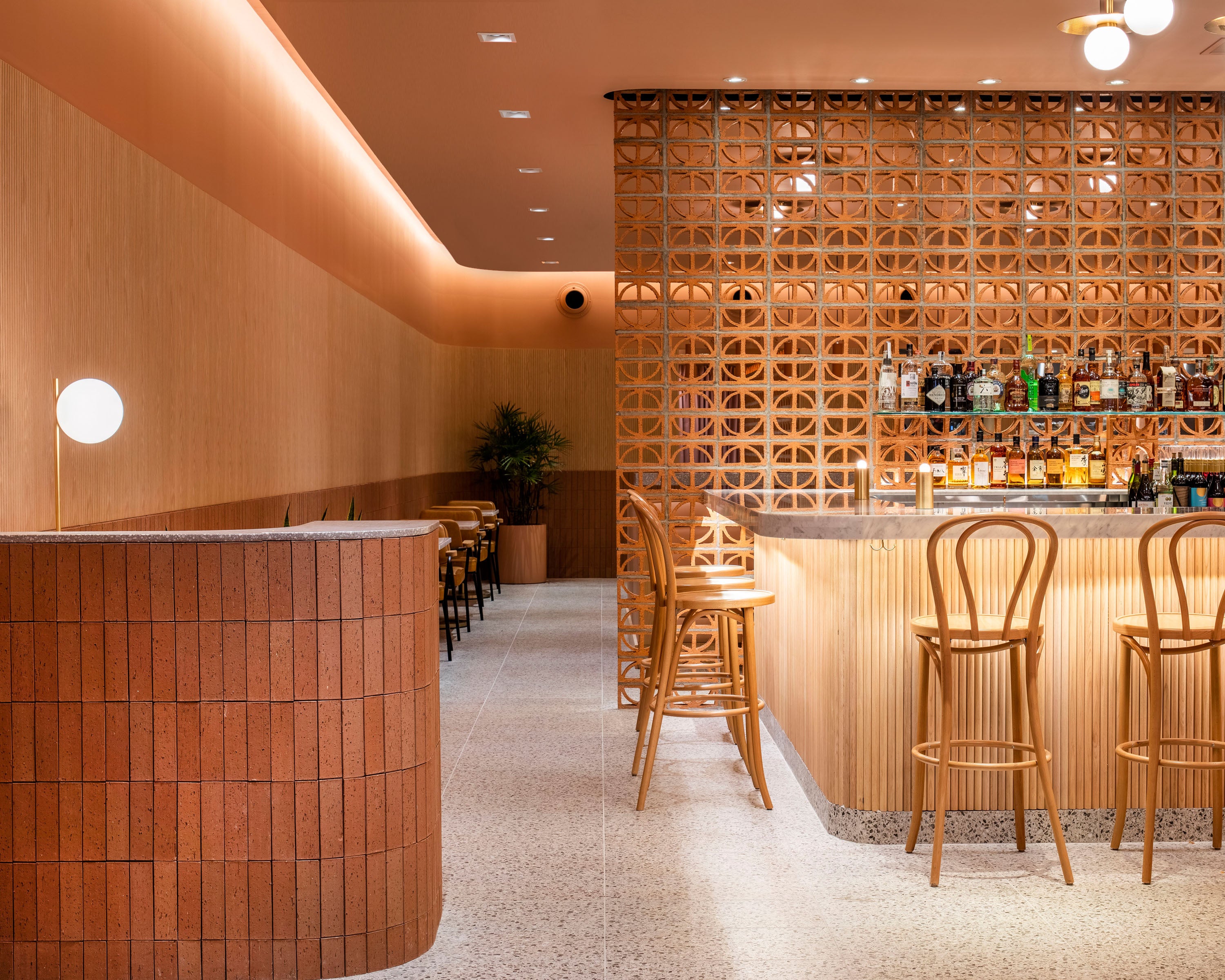
Breeze block wall with Ventana and Petalo blocks, Penacho tile on wall
If you’ve been to Austin you might be aware of our city’s obsession with tacos. There’s no better place to get a taco than our very own chain of taquerías, Tacodeli. They’ve been keeping Austin weird since 1999.
A new Tacodeli recently opened its doors to the family friendly Circle C neighborhood in South-west Austin. Lilianne Steckel designed the restaurant with Clay Imports tile and breeze blocks to add a beautiful Mexico-modern style to the restaurant. She’s going to walk us through her inspirations, design process and more!

Breeze block walls bring a classic mid-century feel to Tacodeli Circle C
Can you tell us about your work with Tacodeli?
Lilianne: Tacodeli is such a beloved restaurant and truly our favorite tacos in town. When they called and said they were doing a new location on Slaughter near Circle C we got so excited about collaborating with them! We wanted to make sure the vibe could translate from morning to night to support their new hours and menus. Whether you’re going in for a quick lunch or catching up with friends over margaritas, we wanted it to be a comfortable place to hang out.
What inspired you?
Lilianne: We got a lot of inspiration from their story and connection to Austin. The founder is from Mexico City. We love traveling through Mexico City and really enjoyed having an opportunity to connect that with the restaurant.
Why did you choose Clay Imports products?
Lilianne: The breeze blocks are such a great material and palette addition. Not only are they textural and a great color, but they provide a semi-solid border material. One of Taco Deli's standards for their locations is a streamlined area from the entrance that leads you to the menu and ordering counter. Breeze blocks seemed great for providing a wall and suggested path to the order counter. We took the same design and mirrored it on the other side of the space to create nooks with banquettes that allow everyone to easily flow and wind through the space. We combined the Petalo and Cubo to give more depth and variation as a way to play with pattern.
When we took over the space, the previous restaurant had a perforated metal wainscoting and natural wood above it on the walls. In order to be cost-efficient and not too wasteful, we took off the metal and replaced it with the Penacho tile on the walls in two colorways and painted the wood white. Industrial no more!

Petalo and Ventana breeze blocks mixed to create a beautiful breeze block wall!
Can you walk us through your design process?
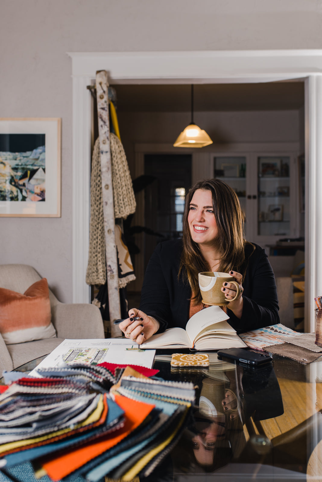
Lilianne: We ask a lot of questions and try to get a good sense of the intentions behind the space. Then we work through visuals and open up a client's design language in order to confirm that we are all speaking the same vibe. Language is a beautiful thing that can also be connected to personal interpretations, and we like taking the time to see what things like “modern” or “fun” mean for each client and project.
What design trend are you vibing on right now?
Lilianne: The plaster walls and earth tones that are very hot right now are gorgeous and relaxing. They remind me of my favorite days on vacation in the coast of Italy.
What social platform do you seek inspiration from the most?
Lilianne: Travel is my number one. But on my phone, this is a strong mix between Instagram and Pinterest!
Do you have any design secrets you could fill us in on?
Lilianne: I always say spend on the big energy pieces, like the art in the entry, dining table you gather around and sofa you hang out on every day. Then you can mix high and low together for accompanying pieces. For commercial, it is the constant mix of high and low, but we love utilizing a few bold areas to balance the more simple details. They make for great photographs as well!
If you could have an unlimited supply of one of our products, which would it be?
Lilianne: I love the Verano Tile Series!
What do you love the most about what you do?
Lilianne: We do both commercial and residential design. It is so rewarding to connect with a client, then feel and see a concept in our minds before it's fully formed. Then walk through it once it is created and implemented. It is a really cool feeling of starting from intention and turning it into something tangible.
Special thanks to Lilianne for speaking with us and make sure to check out more of her work here or on her Instagram. We love seeing all the new ways talented interior designers use our products every day!
And remember, if you have any questions or require more information, don't hesitate to reach out to us at contact@clayimports.com.


 Share
Share
 Pin it


