Written by Jen Pinkston
If you enjoy a good renovation story, this 1970s living room before and after is for you! Keep reading for all the juicy details– paint colors, tile selections and so much more!

If you’ve been following along, you’ve already seen an inside look our remodel. (If not, start here, then go here!) We have finally landed in our living spaces, which honestly came together pretty quickly since there wasn’t much cosmetic work in these rooms, but those finishing touches always take a bit of time. Keep reading for the full 1970s living room before and after reveal!

Let’s start in our main living room. When you walk in the door, there is a raised entry, very 1970s feel to it, which I sort of fell in love with, so we decided to keep it. That leads straight to the view of our living room, which features a shed roof that was initially a sea of popcorn. My husband Chase felt that your eyes just went straight to the ceiling and wanted to add something more aesthetically appealing than drywall. So clad the ceiling in shiplap and ran vertical beams. I was skeptical about the idea at first but now realize what a huge impact it makes on the space. Here are the before of our 1970s living room before and after:
Before


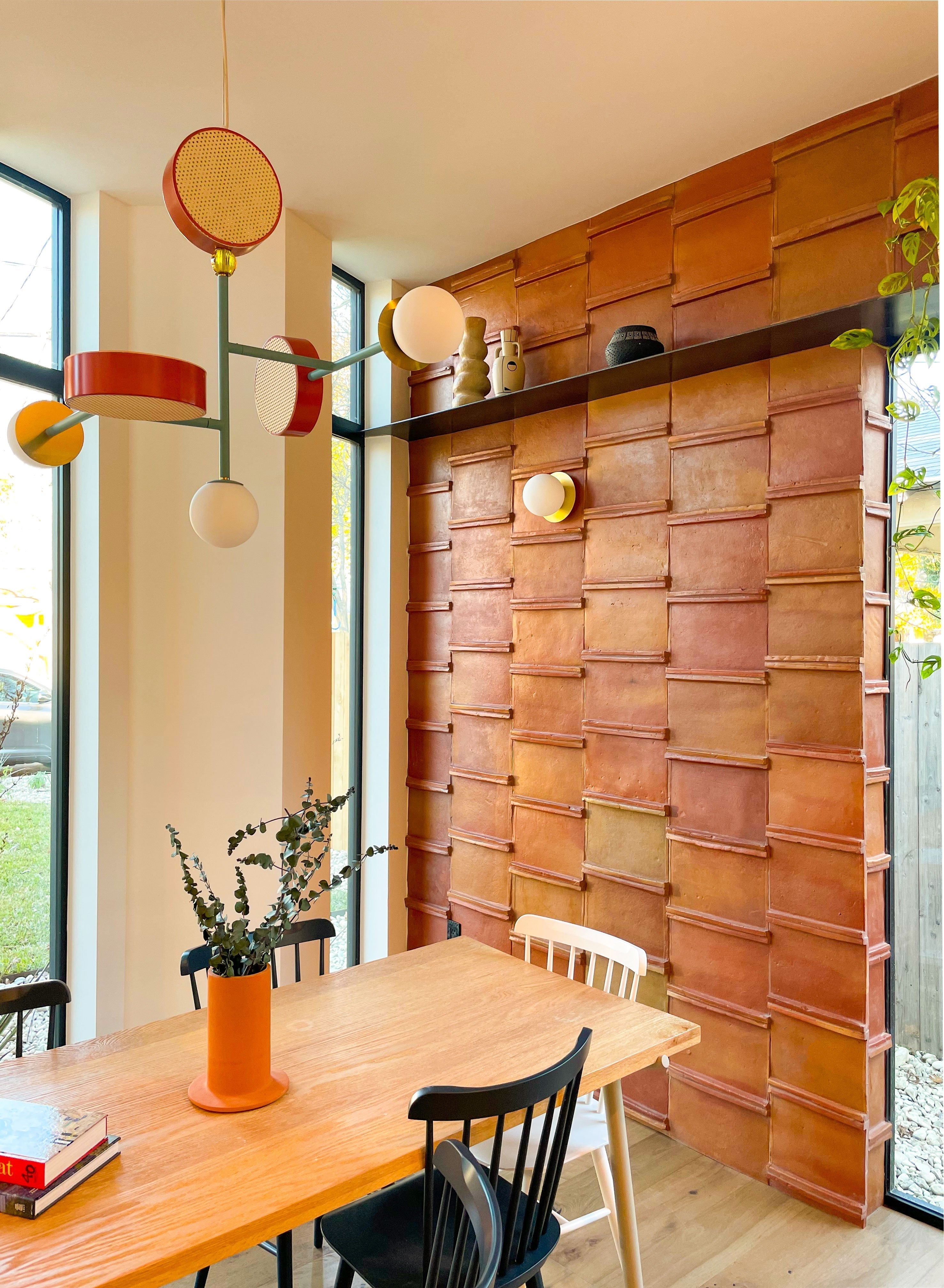
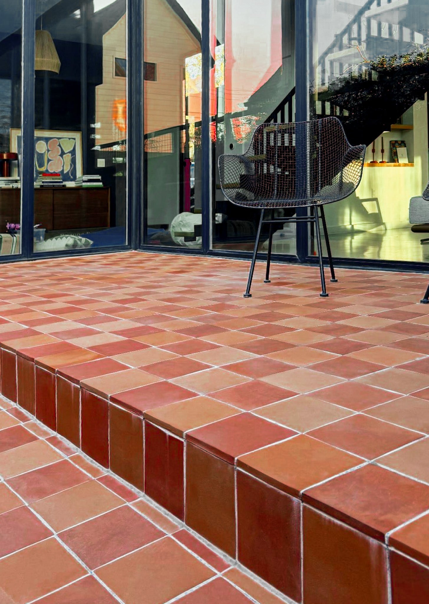
Next up was a very important detail, the fireplace. It’s a main centerpiece of the living room and the house. It was made of stone and pushed close to a corner where the original paneling and 70s shelves framed it. The stone itself was honestly fine. I’m sure many people would absolutely love it, but for us, it was a definite no. We knew we wanted to resurface it in some way and ultimately landed on the idea of a glazed brick. We headed to one of our favorite spots in Austin and chatted with our friends at Clay Imports about some options for resurfacing. We chose a Glazed Saltillo Thin Brick in matte black and also decided to use it on the raised entry to tie the room together.

Chase got the pleasure of watching how these handmade tiles are made, and we love the beautiful character each brick has. Some bricks are more matte than others, and they have lots of variations in texture. Brick is so warm and inviting, which is often the opposite of how many people would describe a modern space. By using these dimensional bricks, we added that warm feel while still keeping within the modern feel of our home.

Though the shelves to the left of the fireplace didn’t bother us, the lack of light in the corner did. So we decided to punch a hole and put in a window. It was one of those smaller decisions that I didn’t really think much of, but seeing ‘before’ images now, I just can’t imagine how dark that area would feel. It’s a pretty significant difference.

Though our walls and ceiling may just look white, it’s super important to not just pick the brightest white you can find. It took us quite a while to land on that perfect warm white. We love clean walls, but we certainly don’t want our home feeling like a surgical center. We went with Benjamin Moore’s Dove White in Aura Interior matte finish. This color is painted throughout our home, we love how bright and big it makes each room feel. Benjamin Moore is one of the few brands that offer a matte finish which is basically between eggshell and flat. I love this paint because it’s easy to clean but really helps to hide imperfections and flaws (which old homes definitely have) because there is no sheen.

Now with the reno details aside, let’s talk furniture and fixtures. For the large feature wall we decided to go with two Humanhome Odis Wall Sconces instead of can light. We found ourselves not loving our can lights in the last house and with the ceiling being a design feature, wall sconces made the most sense. These come in quite a few finishes, we went with white/oak and put them on a dimmer switch. We really love them!

Furniture can be super overwhelming for me and in the past we’ve always purchased used furniture (which I’m so for!) but for this house we decided we’d like to find some quality pieces that had a modern warm feel. We couldn’t resist the beautiful timeless style that Room & Board has to offer. Not only do they make great looking furniture, but they have sustainable practices and products, support of American artisans, and are raising the bar in the minimum wage fight. It’s easy to support a company when these are ingrained in their mission. I can also say that the quality of their furniture absolutely matches their ethical values.

I didn’t know how to go about filling a blank room with furniture, so I started with chairs. My first pick was two modern velvet Vance Olive green chairs. These are probably my favorite color green and I love the juxtaposition of hard and soft. (Also, they are so, so comfy!) My next must-have was the insanely gorgeous hand knotted Kayseri Wool Rug. This rug is so beautiful. I liked it when I saw it online, but when they rolled it out, I actually gasped. It’s truly a work of art.

There were quite a few couches we liked and actually initially landed on one that looked really similar to our previous living room but then decided to lean in a different direction. We went with the Goodwin Vento leather couch in cognac. We love the lines and its art deco feel, it sits perfectly text to our vintage record player.
A favorite piece that I think really pulls the room together is the Graham Walnut Coffee Table. I love that it’s a modern feel with a classic material, it makes a great statement.

Along the back wall of the room we needed something slim since it leads to our main hallway but that would fill the wall space well, so we went with a 12-inch Bowen Console Table with a marble top. It’s perfect for holding our records, books, and even hiding kiddo shoes in a basket. We also nabbed the subtle small Guild Concrete Lamp. Oh, did I mention Room & Board delivers everything and helps set up the room?! So no instruction manuals and no assembly required–what a bonus!

To finish this 1970s living room before and after, we went with an off-center photo ledge over the couch and made a small bench seat next to the fireplace. This room really came together thanks to a few changes and some beautiful finishes, I love how cozy this space feels. I think it’s a perfect example of how a modern home can still feel warm.
Now, let’s head upstairs! This loft was for sure a selling point of this home. It’s about 350 square feet of free space with a vaulted ceiling. We currently use it as a multipurpose room. Chase offices up there, it’s a media room, and there’s a play corner for our daughter. There wasn’t a ton of renovation changes. We actually loved the original railing but installed new carpet because we really wanted it to feel comfy since it’s our media and play room. Here’s the before:

To add to the warm feel, we decided to paint the main wall Benjamin Moore’s Wethersfield Moss Green in Aura Interior matte. As soon as we finished painting it I was like “should we paint the whole house?!” Chase talked me down, but man it is the most beautiful mossy green (have I mentioned I love green?)

Most of the furniture in this room was in our old house and are favorite vintage finds. We did add a Humanhome Olle Lamp to the green wall which is super cute and functional since it doesn’t have to be hardwired. And the couch is a sleeper which is so nice for when we have guests (or a movie marathon). I think that wraps up our home reveal! Feel free to comment with questions.

Thanks for following along! If you enjoyed this 1970s Living Room Before and After, follow along on my Instagram for more details on our home updates. And remember, if you have any questions or require more information, don't hesitate to reach out to us at contact@clayimports.com.
Photography by Chase Daniel
 Share
Share
 Pin it